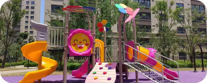
 Buying Guide
Compare 10 Canadian playground equipment manufacturers and suppliers by manufacturing evidence, product focus, regional support, CSA documentation and project fit.
Read insight

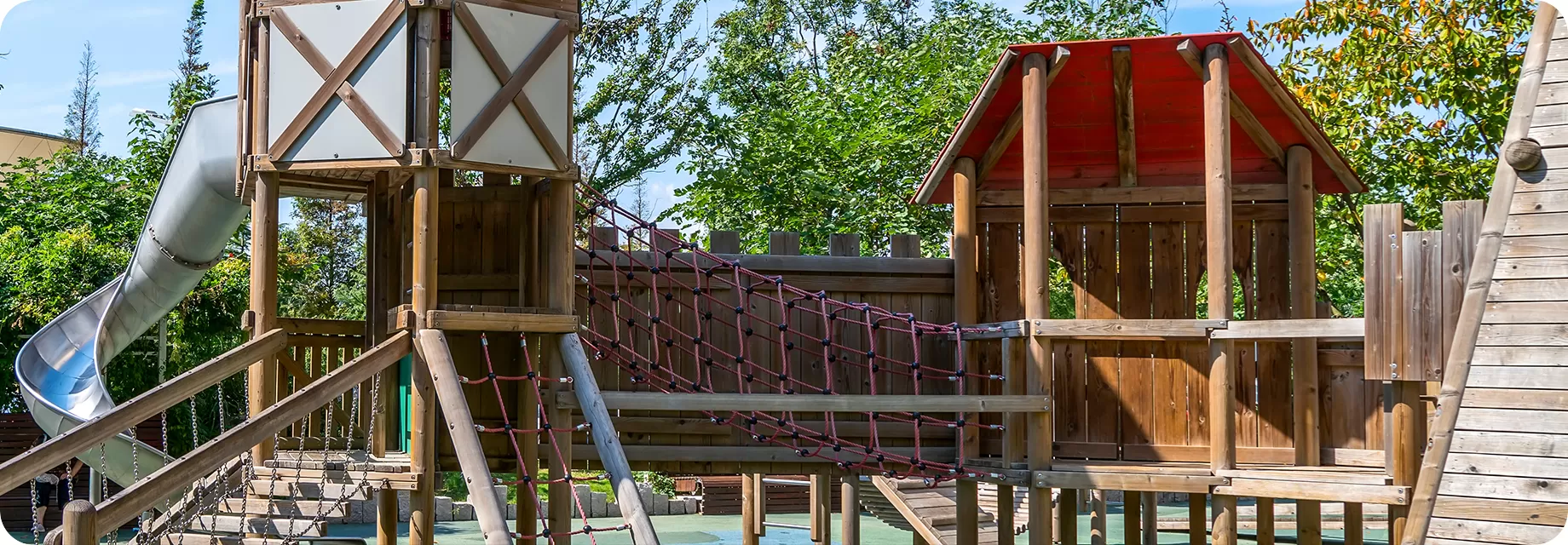
Build a coordinated palette that balances brand identity, user visibility, heat, fading and future replacement needs.
Use a limited system of primary, secondary and accent colours tied to the project identity, user age groups, visibility needs, climate and replacement-part references.
Colour approval should happen on the confirmed equipment configuration. Digital images and screens can vary, so the written schedule and agreed physical references should control production where colour accuracy is important.
Brand or school colours
Landscape and architecture
User age groups
High-visibility features
Sun, heat and UV exposure
Cleaning and replacement strategy
Establish the main identity across larger structural or panel areas without overwhelming the site.
Support the primary colour and separate modules, age zones or play routes where useful.
Highlight entrances, interactive points or brand details in a controlled proportion.
Use wood tones, grey, beige or dark green to connect equipment to the landscape and reduce visual noise.
Use contrast where users need to distinguish edges, routes or key components; verify needs for the actual project.
Record the approved colour against the component schedule so future parts can be identified more reliably.
| Condition | Colour decision | What to verify |
|---|---|---|
| Strong sun and heat | Avoid unnecessary large dark contact areas where surface heat is a concern. | Material, finish, orientation and local climate |
| High UV exposure | Set realistic expectations for colour retention and maintenance. | Quoted material/finish and supplier documentation |
| Coastal or industrial site | Coordinate colour with the protective finish and inspection plan. | Corrosion exposure, coating system and maintenance |
| School or branded site | Translate brand colours into a balanced, producible palette. | Approved references and allowable variation |
| Mixed-age or inclusive area | Use contrast and zoning carefully without implying compliance from colour alone. | Full accessibility and wayfinding brief |
Colour does not replace equipment selection, use-zone planning, accessible design or local safety review. It supports those decisions.
Provide brand references, preferred mood and colours to avoid.
Map colours to posts, panels, slides, roofs, ropes and accents.
Check the palette against site views, landscape and adjacent materials.
Approve the component references, colour codes, revision and date.
Brand references can guide the palette, but the available finish and tolerances depend on the component and quotation. Approve the applicable reference before production.
No. Suitability depends on the component, material, exposure, climate and contact risk. Review large dark contact areas carefully in hot, sunny locations.
Outdoor appearance can change with UV, weather, cleaning and wear. Review the quoted material and finish, maintenance guidance and realistic colour-retention expectations.
There is no universal number. A controlled primary, secondary, accent and neutral system is usually easier to approve, maintain and reproduce than many unrelated colours.
Send brand references, site images and colours to include or avoid so the palette can be applied to the actual configuration.
Practical guidance from playground planning, manufacturing, delivery and completed project experience.
Buying Guide
 Buying Guide
 Factory & Production